La web muestra los flujos migratorios netos entre paises, con datos de NAciones Unidas de los años 2010 a 2015
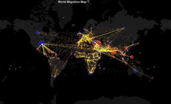
This map shows the estimated net immigration (inflows minus outflows) by origin and destination country between 2010 and 2015. Blue circles = positive net migration (more inflows). Red circles = negative net migration (more outflows). Each yellow…
metrocosm.com|De Metrocosm